Wooster & Stock
Enhanced tech and white elegance for Wooster & Stock.

Introducing Wooster & Stock
A respected and renowned estate agent founded in south east London by Luke Wooster in 1999, Wooster & Stock has been a trailblazer in digital and online marketing for their properties since they began. As one of the first estate agents to adopt this approach, they gained significant traction in areas such as Peckham, Camberwell and Nunhead and have continued to influence innovations in the local estate agency landscape.


The brief
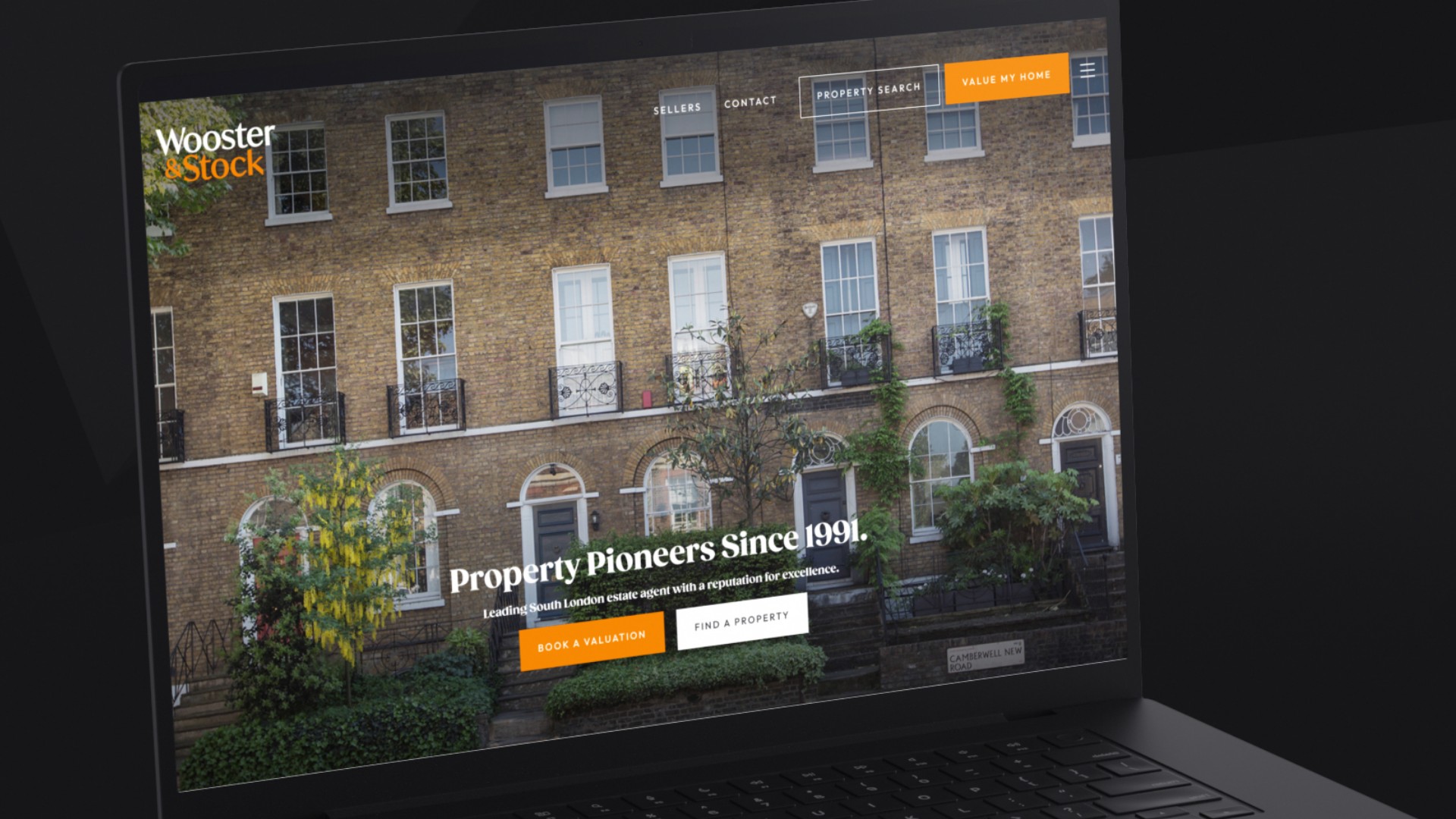
Wooster & Stock sought to modernise and significantly upgrade their website to reflect their status as a leading light in the south east London property market. They desired a new platform with enhanced technology, smarter integrations and a cleaner, more sophisticated aesthetic. The goal was to showcase their beautiful and distinctive properties with clean, uncluttered imagery and simple layouts. Maintaining the signature orange branding in a more subtle and refined manner was essential. The new website needed to depict a middle to higher-end property market focus, rivalling their main competitor, The Modern House, with a first-class online presence.
What challenges did we face?
Wooster & Stock's previous website was managed by a prominent property website provider. However, our client felt the site did not evolve as expected, lacking proactive input and innovative suggestions. They were after a new website partner to be proactive, innovative and attentive to their needs.
The agency was after quite a specific design, being inspired by some very distinguished and clean websites. This was not a run-of-the-mill estate agent, we had to come up with something a little special with bespoke tailoring to suit the client.


Our approach
To meet Wooster & Stock requirements, we took a systematic and client-focused approach:
We began with an in-depth discovery and consultation workshop to understand Wooster & Stock's vision, target market and specific needs. We also researched their competitors to ensure we could create a standout website.
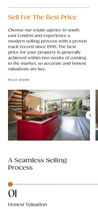
We focused on simplicity and sophistication, developing clean, uncluttered layouts with large, high-quality images to highlight the properties effectively.
Built on our SignaturePlus platform we selected advanced technologies to enhance functionality, including a gallery module for property features and a continuous scroll for listings. Locrating integration provided local insights for each property.
We refined the orange branding to be more subtle and clean, and chose a classic, stylish font for readability and warmth. The orange is used as a strong conversion colour for calls to action and buttons.
We crafted engaging content and provided copywriting for all key pages in a tone that matched their brand, including detailed area pages and a stylish Selling Guide to provide valuable information to clients.

The result
We delivered a website that is both stylish and modern, with a timeless quality. Utilising high-end London property imagery, we created a clean, white site that gives each element ample space to breathe. This approach highlights Wooster & Stock’s premium properties effectively and reflects their brand perfectly.
To enhance user experience, we integrated a gallery module to showcase the features of their beautiful and unique properties. Visitors can now scroll through property images directly on the listings page without needing to click into each property, making the browsing experience seamless and intuitive.
Available properties are displayed on a continuous scroll across several pages, ensuring easy navigation and access to listings. This feature keeps potential clients engaged and informed.
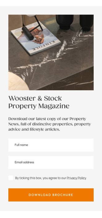
As well as focusing heavily on placing contact forms and CTAs in key positions throughout the site, we introduced a Property Magazine download as a lead magnet form, helping Wooster & Stock collect names and email addresses of potential clients.
To provide comprehensive local insights, we developed detailed area pages for the regions Wooster & Stock operates in, including Camberwell, Nunhead, Peckham and Sydenham. These pages offer valuable information about each area, making the website a resource-rich destination for potential buyers and sellers.
We integrated Locrating, a third-party plugin, on every property display, giving visitors an interactive map with local insights. This excellent feature provides detailed information about nearby amenities, schools (including catchment areas, pupil numbers and latest Ofsted ratings) and broadband speeds, helping clients make informed decisions.
As part of the project, we wrote and designed a stylish Selling Guide brochure. This guide is used in Wooster & Stock’s marketing efforts and valuations, and can also be available as a downloadable resource for data capture, providing clients with valuable information and enhancing lead generation for our client.
We ensured that key selling points and brand messaging were prominently featured in titles and headers throughout the site. A new classic, stylish font was chosen to be warm, inviting, and easy to read, complementing the overall sophisticated design.


So in summary...
The new Wooster & Stock website stands as a testament to their dedication to modernity and excellence in the estate agency field. With a clean, stylish design, enhanced user experience and comprehensive local insights, the new website positions Wooster & Stock at the forefront of the south east London property market. Our proactive approach and innovative solutions have provided Wooster & Stock with a first-class online presence, ready to compete with top industry players.
By combining the advanced technology stack of our award-winning SignaturePlus platform with bespoke elements and sophisticated aesthetics, we have created a website that not only meets but exceeds the expectations of the team at Wooster & Stock, ensuring their continued success and influence in the estate agency landscape. Best of all, our client loves it!
A very happy client
"We are really pleased with the whole process of our website build. PropertyStream has been very enthusiastic throughout and completely understood our requirements and desires from the beginning. The copywriting was perfect, the designs and website layouts were exactly what we wanted, and the communication was excellent throughout. We wanted something a little different that reflected our ethos as an agency, and we are very happy with the results.
The team at PropertyStream is also great at continuing to look after our needs and make suggestions on how to evolve and optimise the website further. We would, without question, recommend them as a website provider.”
Zoe Matheson, Manager, Wooster & Stock
We'd love to work with you.
We can help ambitious brands stand out and earn more with our websites and branding. Discuss a project with one of our specialists today!
Manchester
+44 (0) 333 242 0647
enquiries@propertystream.co
26 Dale Street, Manchester, M1 1FY
Find us on Google Maps
London
+44 (0) 333 242 0647
enquiries@propertystream.co
326 City Road, London, EC1V 2PT
Find us on Google Maps
Copyright © PropertyStream Ltd. 2026. All rights reserved.