Website design trends 2024: Bring back rounded corners
In a series of blogs about website design trends in 2024, we’ll share our insight, opinion and knowledge about a host of web design areas. Here we talk about the resurgence of rounded corners.
In the ever-evolving landscape of website design, trends come and go like seasons, but some trends have a way of making a stylish comeback. One such trend that's making waves again is the use of rounded corners. Having been in the web design field for over 15 years, we've witnessed the ebb and flow of this trend, and must say, it's back with a softer, more appealing vibe than ever before.
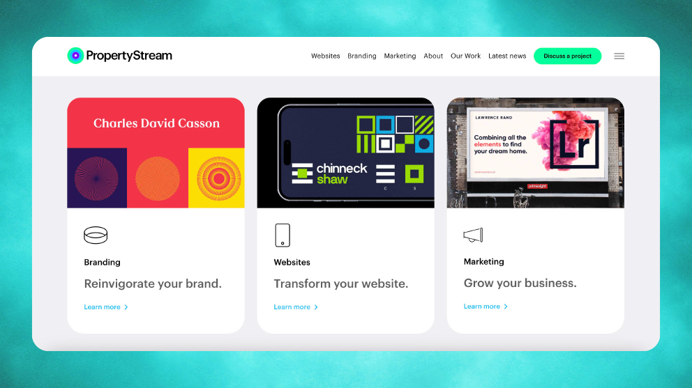
The resurgence of rounded corners brings a refreshing change to the digital canvas. Often referred to as the "bento style," this approach smoothes out the harsh edges of design elements, creating a visually inviting and contemporary look. Think of it as adding a touch of warmth and friendliness to your website's aesthetics.
Inspiration for rounded corners
One of the pioneers in embracing rounded corners is none other than Apple. While it's hard to pinpoint exactly when they adopted this style, their website now showcases sleek designs with rounded edges that exude elegance and sophistication. For a company of such calibre to adopt this trend speaks volumes about its longevity and impact.
When it comes to implementing rounded corners, there's no one-size-fits-all approach. Some designs opt for a subtle curve, while others embrace a more pronounced roundness. However, it's essential to strike a balance as excessively rounded edges can affect the layout and positioning of content, potentially compromising user experience.
Minimalist website
For minimalist and creative websites with limited content, highly rounded edges can work wonders, adding a dash of playfulness to the design. Take, for instance, our clients Nicol & Co, a forward-thinking estate agency in Worcestershire that has boldly adopted rounded corners, making a statement in the realm of estate agency websites.
However, not every website is suited for rounded corners. It's crucial to consider your brand identity and offline presence when incorporating design trends into your digital space. Your website should seamlessly align with your brand ethos and values, ensuring consistency across all touchpoints.
A prime example of subtle implementation can be seen in websites like McFarlane Property, where rounded corners complement the overall aesthetic without overshadowing the content or brand identity. It's all about finding the right balance between style and functionality. We designed and built the McFarlane website too and feel it’s a beautiful example of a contemporary, yet classy website where rounded corners work really well.
Staying adaptable
In conclusion, the resurgence of rounded corners in website design signifies a shift towards more approachable and visually appealing digital experiences. Whether you're a minimalist enthusiast or a brand powerhouse, embracing this trend can breathe new life into your online presence.
As trends continue to evolve, it's essential to stay adaptable and open to exploring new design possibilities. If you're ready to elevate your website's user experience, don't hesitate to reach out for a comprehensive website review. We’re focused on creating digital experiences that leave a lasting impression and help to drive business success through powerful lead generation.
For a free website review or design tips for your website, call 0333 242 0647 or email enquiries@propertystream.co
