Why calls to action are critical for estate agent websites
In today’s digital landscape, estate agent websites are essential tools that not only showcase properties but also drive lead generation and conversions. A well-structured website is key for estate agents to stay competitive, and clear, compelling calls to action (CTAs) are the cornerstone of effective design. Effective CTAs guide visitors to take specific actions such as booking a valuation or scheduling a viewing, and when placed strategically, they help move clients seamlessly through the decision-making process. This article delves into why CTAs are vital to estate agency websites and how best to position them for maximum impact.
The role of calls to action (CTAs) in driving engagement on estate agent websites
In digital design, CTAs are more than clickable buttons; they are focal points that invite users to engage. For estate agency websites, CTAs like “Book a Valuation,” “Book a Viewing,” or “Contact Us” are indispensable for guiding users toward meaningful interactions. When positioned strategically, CTAs increase engagement, improve the user journey, and ultimately drive conversions.
Our agency’s work with Ewemove’s ground-breaking website demonstrates the power of a strong CTA strategy. Tasked with creating a high-converting website, we focused on maximising valuation bookings while maintaining an award-winning design that didn’t compromise on style. The original Ewemove website not only set industry standards but also earned accolades as Website of the Year at The Negotiator Awards and The Times Best Website in 2016. Through this project, we fine-tuned our expertise in optimising CTA placement and design elements for maximum conversions—expertise that has continued to evolve in every estate agent website we build today for small to large independent estate agents up and down the country.
Strategic CTAs will drive income growth
For estate agents, CTAs are critical revenue drivers. They capture leads, convert viewers into clients, and prompt users toward key actions. Clear, well-placed CTAs keep users engaged and make navigation intuitive, ultimately creating a smoother experience. Here’s why effective CTAs are essential for estate agent websites:
Guiding user intent
Estate agency websites attract visitors with various goals: sellers needing valuations, buyers interested in viewing properties, or landlords seeking property management services. Strategic CTAs ensure that users can quickly navigate to the right page or service, providing an intuitive experience that matches their intent.
Improving user experience and reducing friction
CTAs eliminate unnecessary clicks by making each next step obvious. For example, after browsing property listings, a “Book a Viewing” button should be accessible immediately. This seamless flow keeps users engaged and leads to higher conversions, as they can progress through the site with minimal effort.
Optimising conversions
Design and placement of CTAs directly impact conversion rates. In our Ewemove project, we optimised CTA placement, form structure, and branding elements to boost conversions. Combined with an aggressive SEO and Google Ads campaign, the website set industry records for valuation leads, proving that high-quality CTA optimisation, in combination with a strong digital marketing strategy, yields exceptional results.
Conveying professionalism and brand credibility
CTAs reflect an agency’s commitment to client service. Prominent, action-oriented CTAs show that the agency is ready to engage, which builds trust with users. CTAs such as “Call the Office” or “Contact Us” are reassuring, especially for those looking for immediate assistance.

Key CTAs for estate agents to include
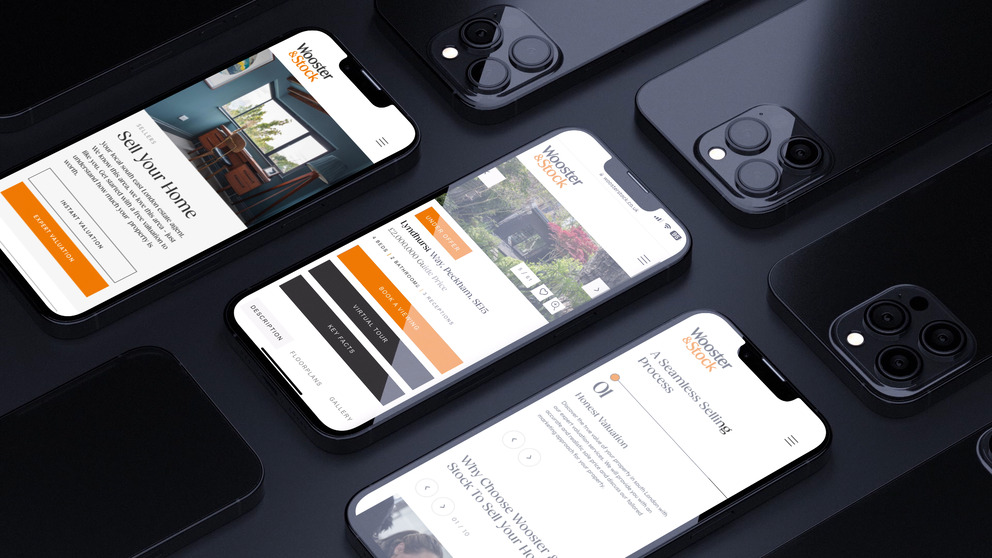
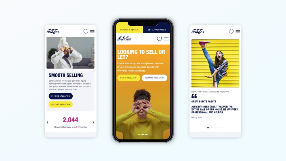
The most important CTA for estate agents is “Book a Valuation,” as valuation bookings directly impact income generation. This CTA should be easy to locate, ideally appearing not just on the homepage but also on secondary pages like property listings and service pages. Other essential CTAs to include are:
- Book a viewing
This CTA should be prominent on property listings, allowing potential buyers or renters to easily schedule viewings. This CTA streamlines the buyer journey, helping to move clients from interest to action quickly. - Contact us / call the office
Clients at different stages of their property journey may have questions or need immediate help. “Call the Office” buttons on the contact page or throughout the site provide quick access to agency contact details, increasing client interaction. - Sign up for property alerts
This CTA enables potential buyers to stay updated on relevant listings, drawing them back to the website and building a long-term client connection.
Placement strategy: where should CTAs go?
When it comes to CTA placement, estate agent web designers know that strategic positioning can be the difference between a visitor clicking through or bouncing. Positioning should follow user behavior, with CTAs appearing at key stages of the user journey.
- Above the fold on the homepage
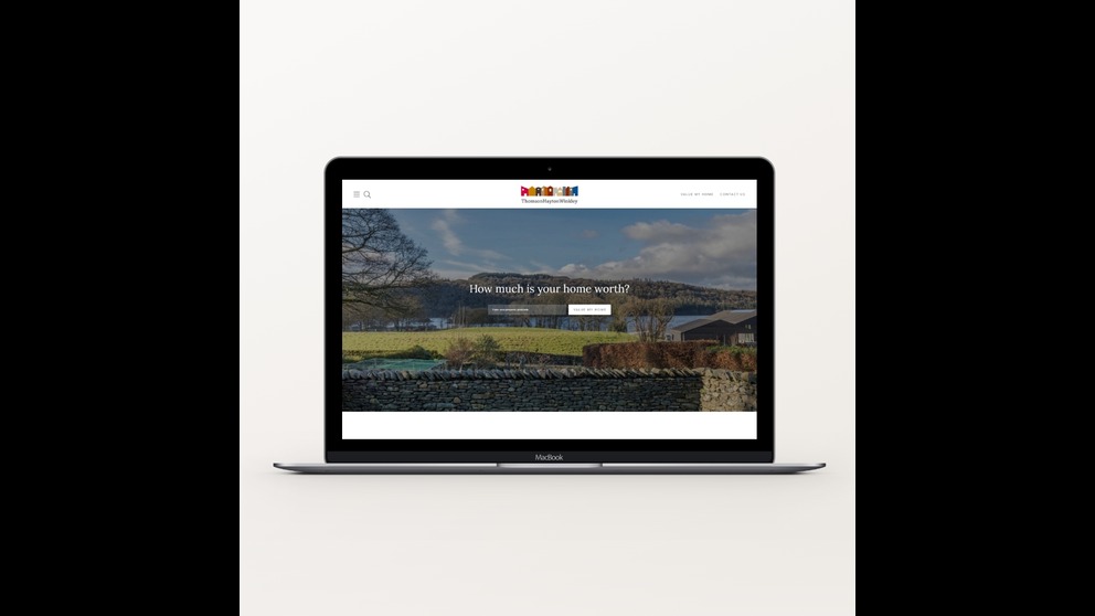
Ensure that primary CTAs, like “Book a Valuation,” are visible immediately upon loading the homepage. This CTA will capture the attention of visitors looking to engage from the outset. - Throughout property listings
A “Book a Viewing” CTA should be clearly accessible on every property details page, so users can easily book a viewing without needing to navigate elsewhere. - Sticky headers
Sticky headers are a powerful tool in web design, keeping essential navigation elements in view as users scroll down the page. By placing “Book a Valuation” in a sticky header, estate agent websites can ensure that this CTA remains accessible no matter where the user is on the page. This keeps primary CTAs front and center at all times, increasing the chances of conversion. - Property listings ‘adverts’
It is a good idea to include compelling “Do you have a property to sell?” CTA banners within the property listing display pages. That way you will attract the attention of the user as they scroll through the property search results and may prompt them to get in touch to value the home they are selling, while browsing for a new purchase. - End of content sections
On longer pages like blog posts or about pages, place CTAs like “Contact Us” or “Learn More” at the end of the section. This approach keeps users engaged and invites them to take action after they’ve absorbed relevant information.

Balancing design and CTA impact
While CTAs are essential, they should never come at the expense of design. Our agency has built a reputation for delivering striking websites that blend powerful CTAs with sophisticated aesthetics. From carefully chosen brand colours to an intuitive site structure, we ensure every aspect of our designs is polished and cohesive. Our dedication to beautiful, functional websites means that each project is both visually compelling and conversion-driven. For estate agency websites, the result is a balanced experience that invites engagement without sacrificing brand identity or aesthetic appeal.
Our Signature line of websites incorporates the lessons learned from award-winning projects, including the original Ewemove website and many more since, to offer the ideal balance of design and functionality. Each product, from off-the-shelf templates to custom builds, is crafted with strategically placed CTAs that fit seamlessly within a high-performing design.
Ready to make your website a lead-generating powerhouse?
Contact us today to discuss how our expertly crafted estate agent websites can drive your business forward. With our experience and passion for digital design, we’re here to help you convert visitors into loyal clients. You can take a look at some of the website we have designed under Our Work.
