Expose
A contemporary, user-friendly website with modern branding, shortlisted for Website of the Year.
The challenge
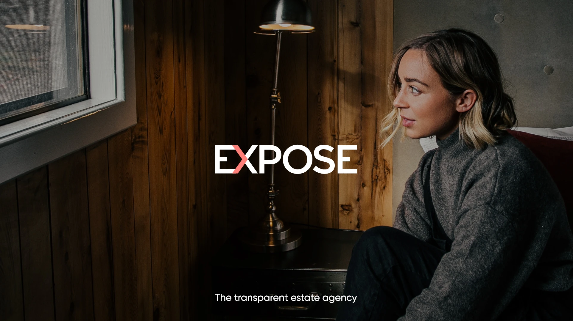
Expose is a new, evolutionary estate agent for London and the South East. They strongly believe in empowering customers, managing expectations and using awe-inspiring marketing and technology to drive the best results.
They do things differently, they let their customers speak directly to their buyer or seller and have a unique sliding scale fee structure that means their customers only pay a fee that reflects their performance. This was all to be communicated through their new brand and website.


The brief
The founder of Expose, Graham Colliss, came to us for a bespoke brand and website that would reflect his evolutionary estate agency idea. He wanted it to be very sleek, modern and clean and at the same time communicate to customers quality and sophistication, but not pretentiousness. The compelling design would need to marry up with seamless UX focused lead generation on the website and use forward thinking technology to ensure convenience.
Our approach
To be able to create an original, modern brand we got to know Expose – from their target audience to their values to their vision. From this information we knew going forward the brand had to be minimalistic. We focused on using the colours black and white to keep it simple and introduced a pink to give visual prominence.
The minimalistic approach would be kept throughout the website with property images doing the talking. We wanted to create visual interest by using animations, subtle interactions with CTAs and where there were videos for them to move in size.
To keep the website easy for users, the integration of Street would mean users could conveniently book a viewing 24/7 and with Expose being a new estate agent breaking into the London market, they would benefit from having local area guide pages that would contain useful information targeted to sellers as well as insights for buyers.
The result
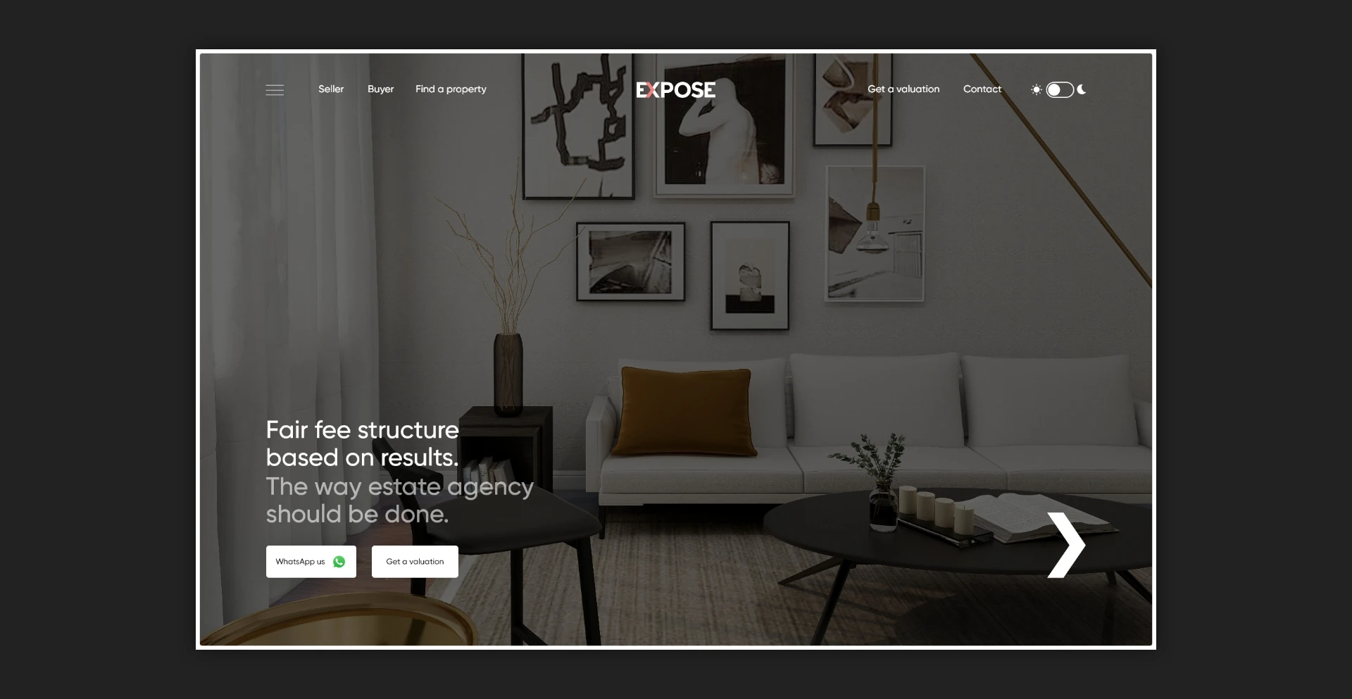
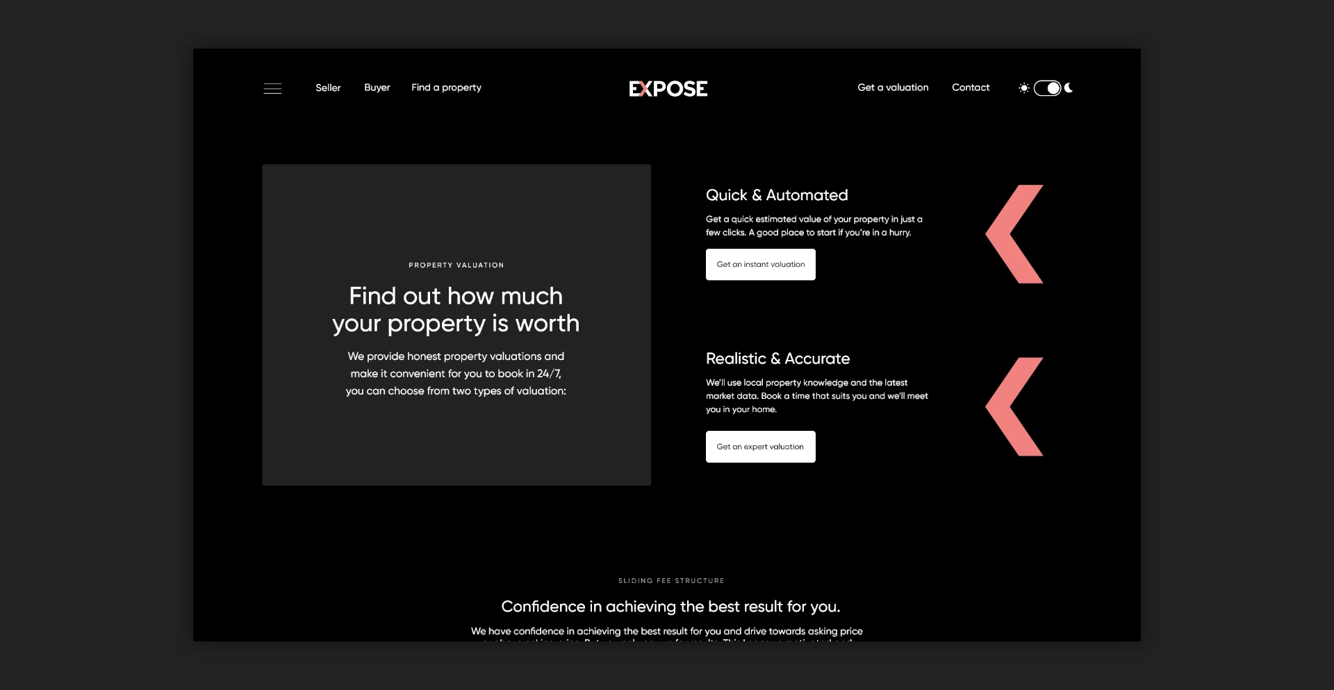
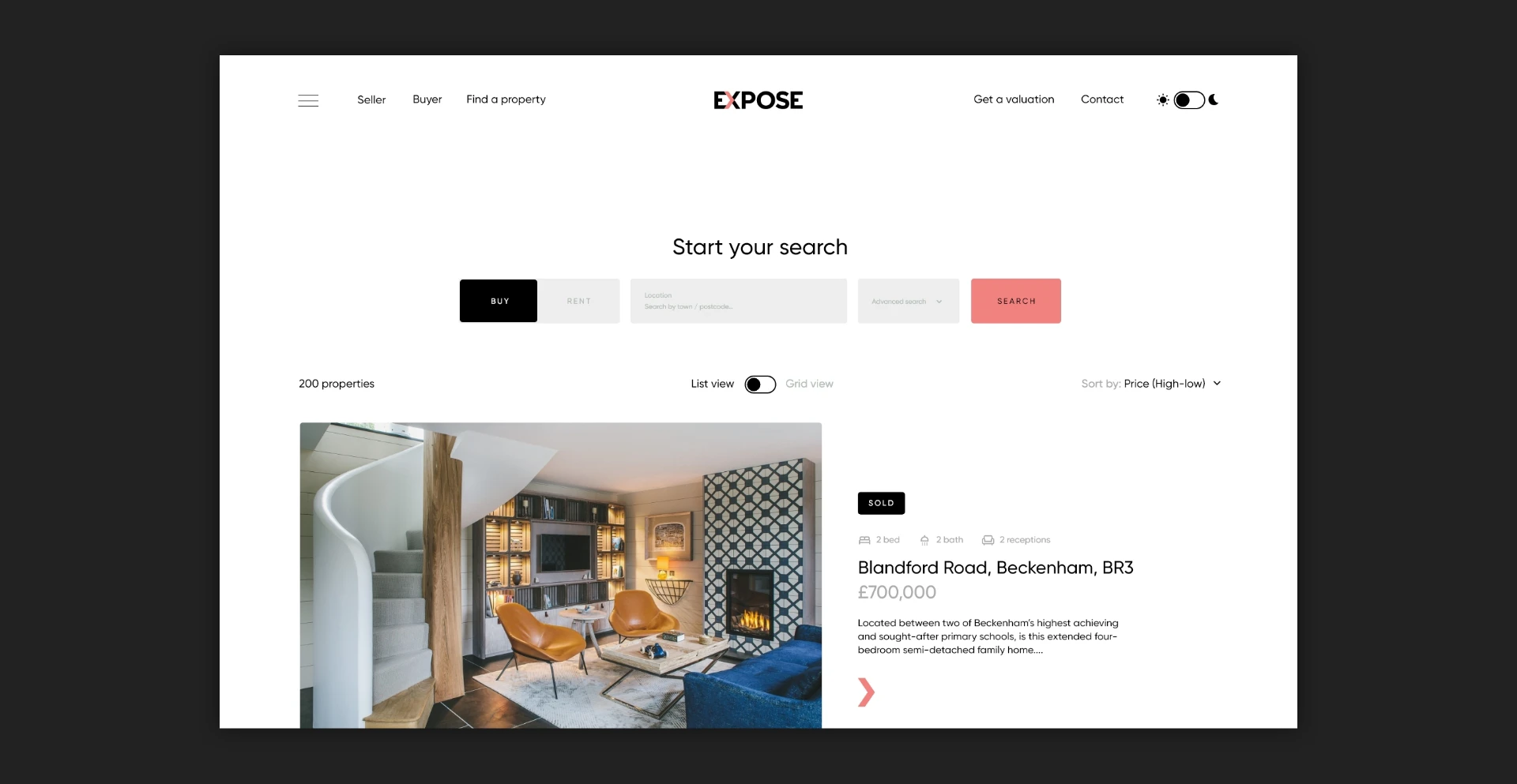
The result is a contemporary, user-friendly website with modern branding. Shortlisted for best Website of the Year at the 2023 Negotiator Awards, the compelling design and genious use of video makes this a stand-out website. The brand represents bold and daring, not sticking within the moulds of traditional estate agency. The pink arrow in the logo represents progressive movement and has been used around the website to point users in certain directions.
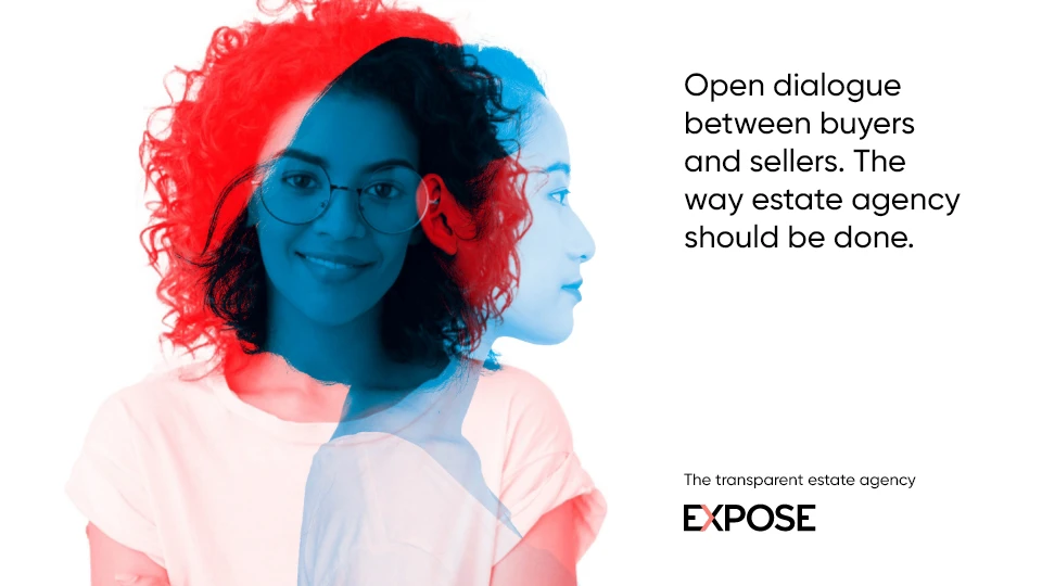
To symbolise a key value of being transparent with customers and allowing buyers and sellers to communicate, duo-tone images with double exposure are used where relevant.
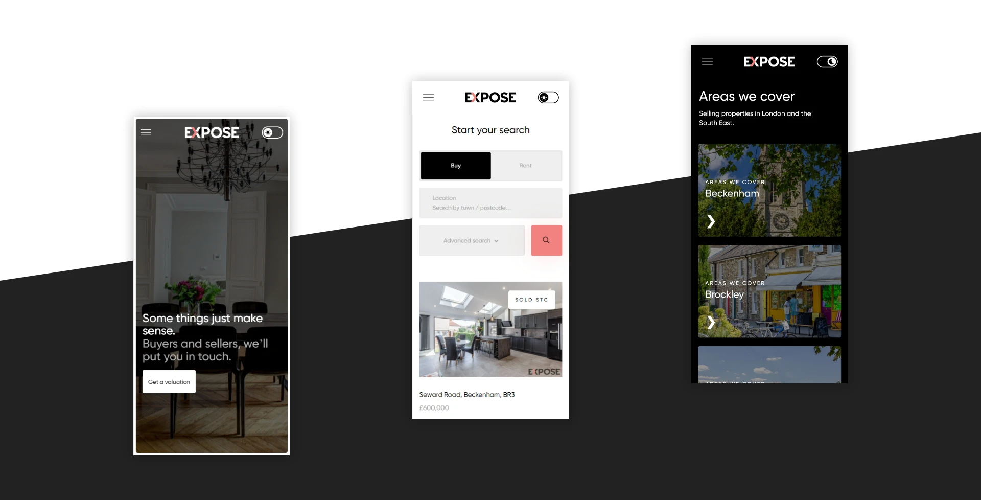
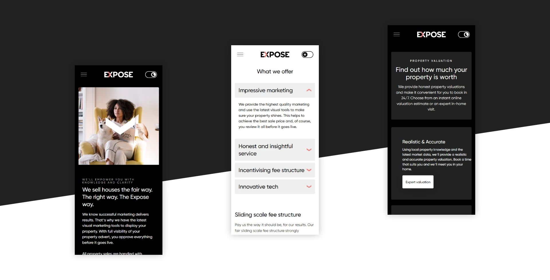
A great, unique feature of the website is the light and dark mode, where the user can view in their preferred mode. Also, the mobile responsiveness of the website is clean with every page being designed for mobile – the website works well on all screen sizes.
To help the user understand what Expose is all about, key business concepts are portrayed through video and animation, this includes the demonstration and explanation of the sliding scale fee structure.
We'd love to work with you.
We can help ambitious brands stand out and earn more with our websites and branding. Discuss a project with one of our specialists today!
Manchester
+44 (0) 333 242 0647
enquiries@propertystream.co
26 Dale Street, Manchester, M1 1FY
Find us on Google Maps
London
+44 (0) 333 242 0647
enquiries@propertystream.co
326 City Road, London, EC1V 2PT
Find us on Google Maps
Copyright © PropertyStream Ltd. 2024. All rights reserved.