
Simmons & Son
From 2% market share to 11%. Here's how we helped.
Background
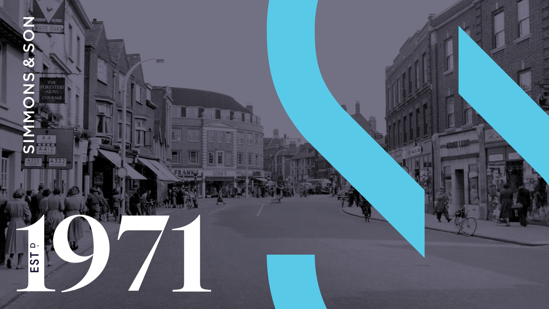
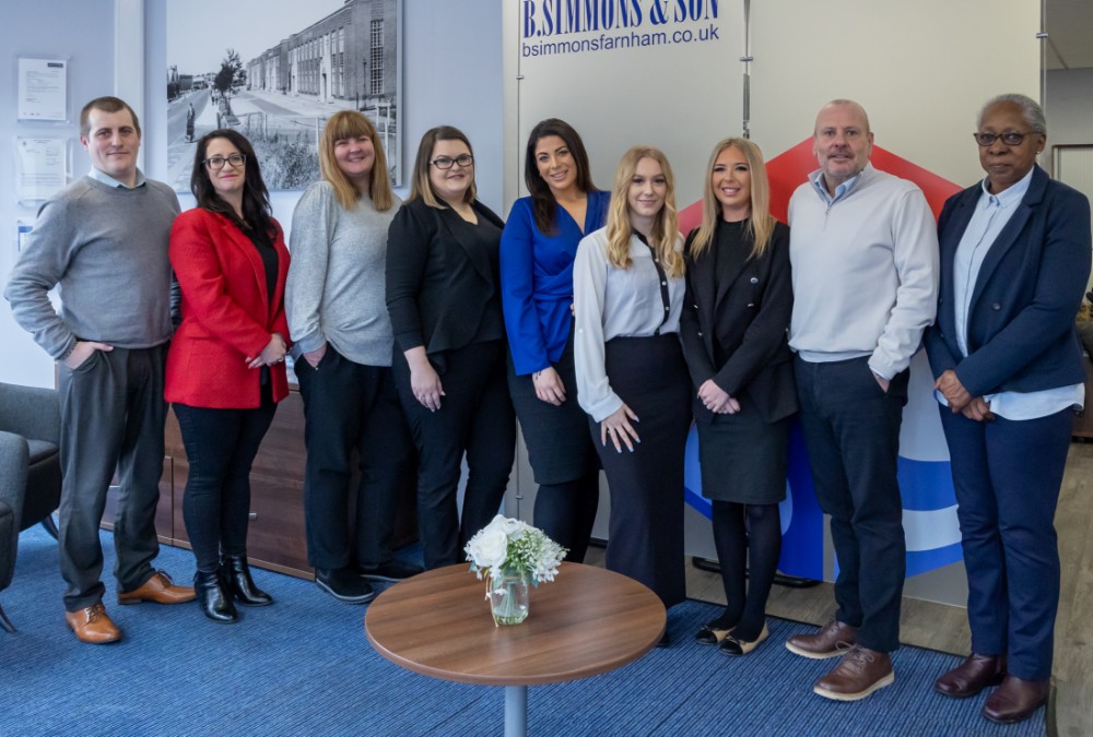
Founded in 1971, B. Simmons & Son is an independent, family-owned estate agent in Slough. Known for being an inclusive agency cemented in the local community, the agency is today run by Director James and Annette Poole and Managing Director Sarah Campbell.
A recognised and respected name in the lower to mid market among the older generation, B. Simmons & Son was less known with the younger generation and less chosen by higher-end sellers. The agency was in need of a rebrand to modernise and elevate its brand appeal across all ages and all markets.
Goals that defined our brief
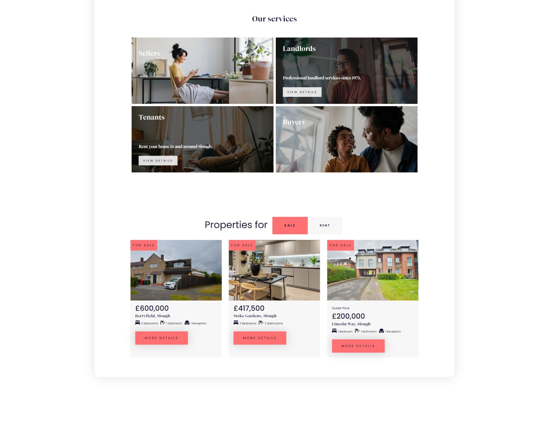
B. Simmons & Son asked PropertyStream to refresh their existing branding, create a swanky new website and supercharge their marketing with new creatives and initiatives.
Here’s a summary of their brand, business and marketing goals:
“B. Simmons & Son aims to dominate the Slough property market, focusing on sales and lettings of mid to high-end properties. We seek to expand beyond Slough and become a cornerstone of the local community.
We aim to reaffirm our role as the local community estate agent, blending heritage with a contemporary identity and a new brand look. We may consider a name change and need a dynamic marketing push.
We’re looking for customisable for-sale and to-let boards to create a unique selling point and spark conversation”.
The client was also looking for a cohesive marketing strategy across all channels, including for-sale boards, portals, CRM, direct mail, website and social media to enhance brand awareness and generate more leads. The team wanted to retain the blue colour that defined the business but were open to refined colour variations.
What was the challenge?
Rebranding B. Simmons & Son involves the risk of losing the brand recognition built since 1971. The challenge was to modernise the brand while retaining the trust of long-time clients and appealing to a broader, contemporary audience.
B. Simmons & Son had a brand that reflected the era it was created in - the early 1970s - and the team were after something modern and new. One challenge was to navigate stakeholders and potential resistance to changing the name and creating a brand new logo and logo mark.
Ensuring consistent brand identity across all marketing channels is essential for maintaining awareness. Introducing customisable for-sale boards must be executed carefully to become a distinctive feature, not a gimmick. Refining the name and colour palette involves thoughtful changes that enhance the brand without compromising its established identity.


How did we approach the brief?
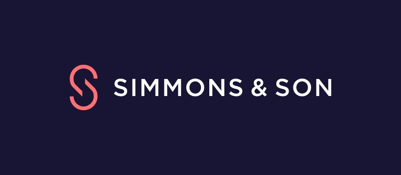
We were keen to explore ways to simplify the name and presented the case for changing the name from B. Simmons & Son to Simmons & Son. Easier to say and more memorable, making it more appealing to new audiences. Luckily the client was receptive, and following internal stakeholder discussions, the new name was adopted. In terms of developing the new brand identity, Michael Barrow, Lead Designer at PropertyStream, said:
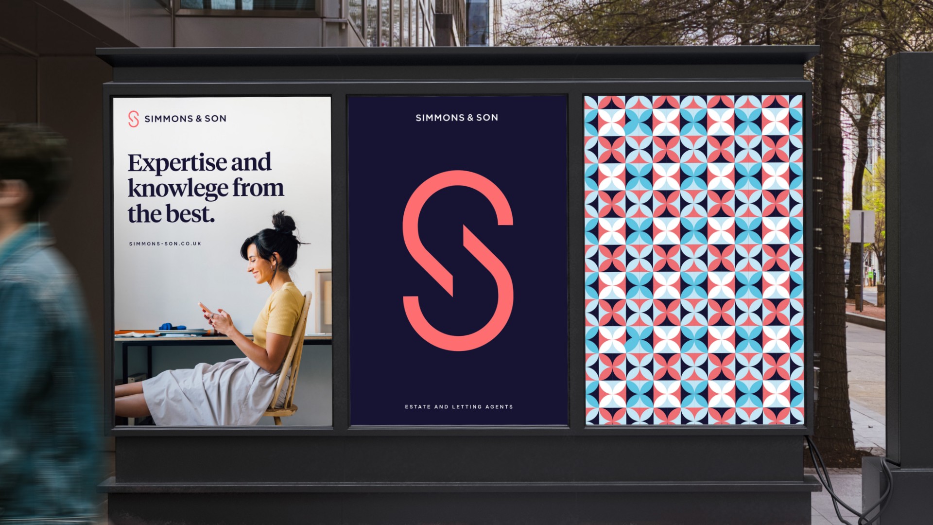
“To retain brand recognition, it was important to keep the blue and the red as the core colours in the new branding. We deepened the blue and introduced a lighter red, with tones of coral, to give the brand a more contemporary and refined feel. The new colour palette has been supplemented by a light blue to add vibrancy and act as a highlight colour.
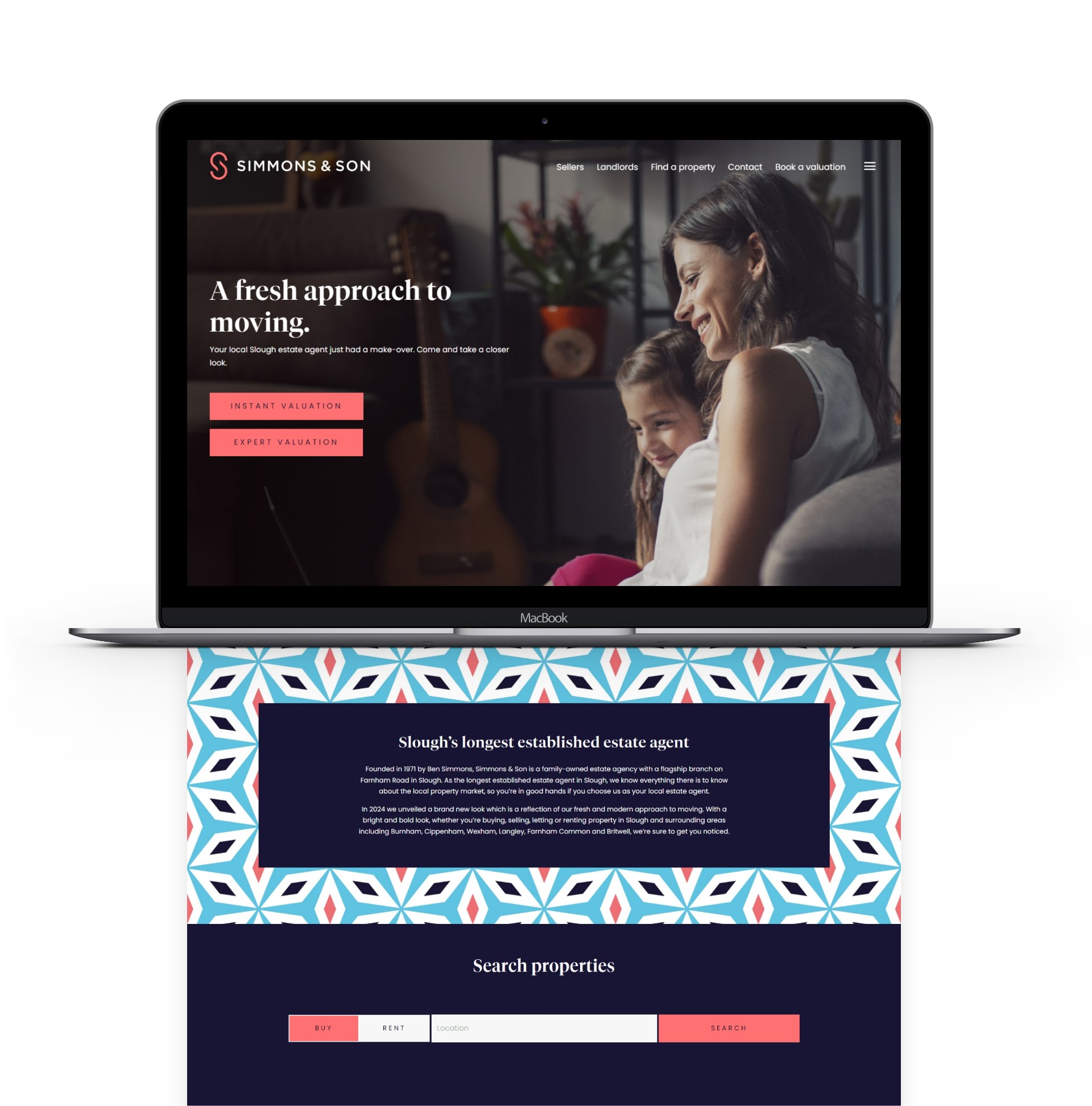
The new name and logo uses a modern Serif as its primary font, giving a nod to their heritage and previous logo which also incorporated a font within the Serif family. We came up with a clean and simple logomark that uses curves and negative spaces to create a stylish and sleek ‘S’. The logomark is strong and memorable, adding a contemporary and flexible dimension to the new brand identity.”
Balancing old with new
The revised name and logo instantly lifted and modernised the brand. We adopted natural lifestyle imagery combined with striking repeat patterns across their new website. We also demonstrated how the new branding can be stylishly applied alongside black and white photography of the local area to reflect the agency’s strong heritage.
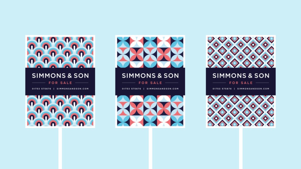
To add a new dimension to the brand, we produced a suite of bold repeat patterns in the new bright brand colours, representative of the last five decades of wallpaper designs. The patterns give the brand a dynamic and flexible edge.
Eye catching results
The streamlining of the business name from B. Simmons & Son to Simmons & Son has brought clarity and ease-of-use to the business. The letters BS - for B. Simmons - featured within the logo lock-up of the old name. After the rebrand, the agency proudly announced that they had ‘dropped the BS’ in their new-look branding. A bold and attention-grabbing message loved by our client!
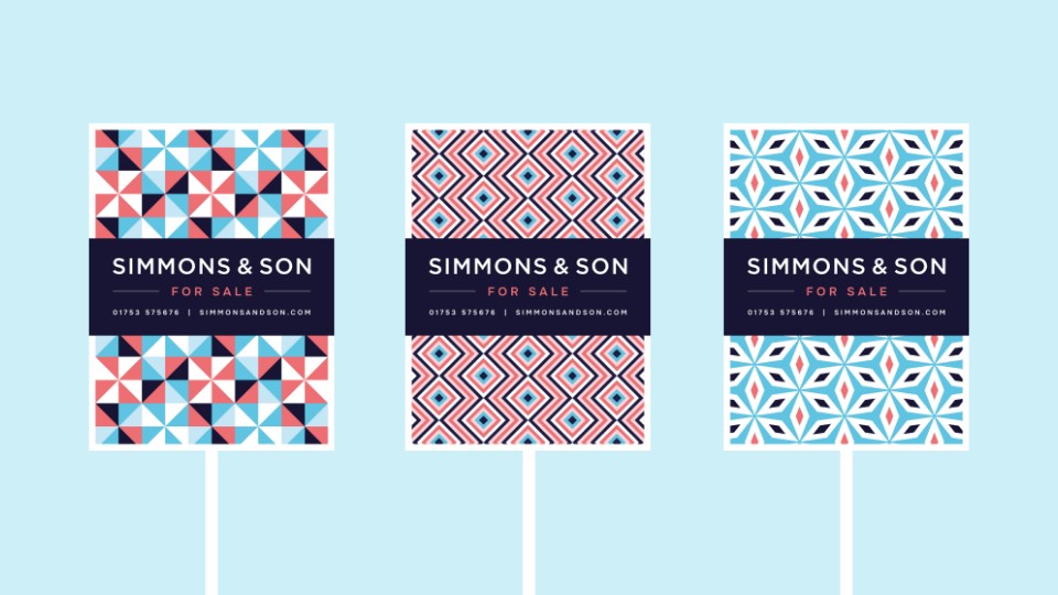
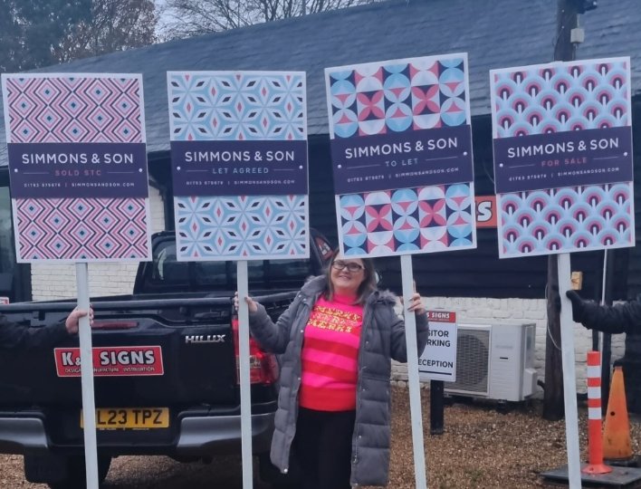
The repeat patterns produce a kaleidoscope of colour and vibrancy and are perfect for multiple applications such as business cards, for sale boards, large advertising hoardings and marketing campaigns suitable for online and offline channels. You can explore more variations and evolve the repeat patterns as you go, to keep the brand fresh and engaging for many years to come.
The striking patterns were the cornerstone of a new suite of for-sale and to-let boards. We created several options as the team wanted to offer customers the ability to choose their favourite design.
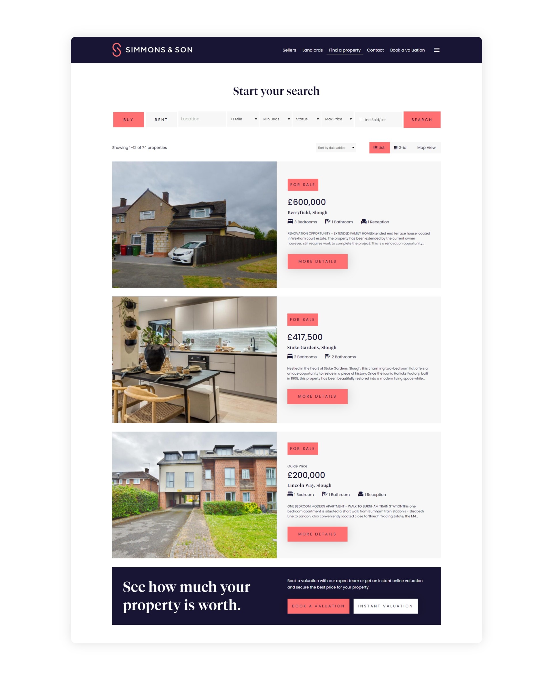
90% increase in website traffic through high-performing SEO
Once the brand and website were created, we needed to make sure both got noticed! Through our proven SEO strategies we made significant improvements in online visibility within five months. Organic website traffic increased by a staggering 90% between February and June 2024, a brilliant result.
Keywords for primary Slough estate agency searches saw a remarkable acceleration of 10 positions on Google, quickly reaching the top tier of page one. Similarly for property management and lettings keywords - where the business was not ranking at all - we have achieved strong gains in visibility, moving towards prominent positioning on Google, at pace.
Powerful Google search advertising
We also created a highly targeted Google adwords campaign which is resulting in strong impressions, clicks and conversion rates. This campaign focuses on sales valuations within Slough. For the team, that means more traffic, more valuation requests and more enquiries. Here's what Amy West, Sales Manager, had to say:
“I've seen a phenomenal increase in valuation requests from the website, nothing like we’ve ever seen before. Combined with our exceptional service delivery and great team, the rebrand, new website and the ongoing marketing campaigns have seen Simmons & Son leap from 2% market share to 11% for sales in Slough”.
Amy West, Sales Manager
Transitioning to the new brand
Communicating a brand change, especially a name change, requires a considered strategy. We made sure assets were produced for every channel. To help our client manage the transition from old to new, we produced an eye-catching animation, suite of social media visuals as well as designs for outdoor advertising including local bus routes and a large billboard. Managing Director Sarah Cambell was amazing at considering all avenues and ensuring quick adaptation of new materials.
A brand and website launch video highlighted the changes in the branding, the features and benefits of their new website and the message around heritage as well as the retention of their brilliant local team.
Ongoing content creation and social media management
We continue to support our client with monthly content creation including animations and social media graphics. To ensure their social media feed includes a balanced ratio of branded content, properties and local posts, we share branded messages and the content we produce on Instagram, Facebook and LinkedIn. We work proactively with Sarah and the team to deliver materials that align with their current business priorities. For instance, we produce campaigns for new-build developments they are marketing, such as the Horlicks Quarter. We have also worked with the team to cement their role in their community by initiating and creating their ‘Moves That Matter’ proposition.
A very happy client
“From the beginning the team took time and care to understand our goals and direction of travel. They presented design routes that were all impressive, and recommended a new name and look that we love! It is strikingly modern, fresh and fun. Our website is delivering more leads than ever before, we are proud to show it off on our valuations. The ongoing marketing support offered by PropertyStream is of great standard, produces strong results and helps take the pressure off the team.”
Sarah Campbell, Managing Director, Simmons & Son
We'd love to work with you.
We can help ambitious brands stand out and earn more with our websites and branding. Discuss a project with one of our specialists today!
Manchester
+44 (0) 333 242 0647
enquiries@propertystream.co
26 Dale Street, Manchester, M1 1FY
Find us on Google Maps
London
+44 (0) 333 242 0647
enquiries@propertystream.co
326 City Road, London, EC1V 2PT
Find us on Google Maps
Copyright © PropertyStream Ltd. 2026. All rights reserved.